Discover Channel >
Redesign 2019
Studio : Radley Studios
Delivery : Pitch Presentation
Role : Design
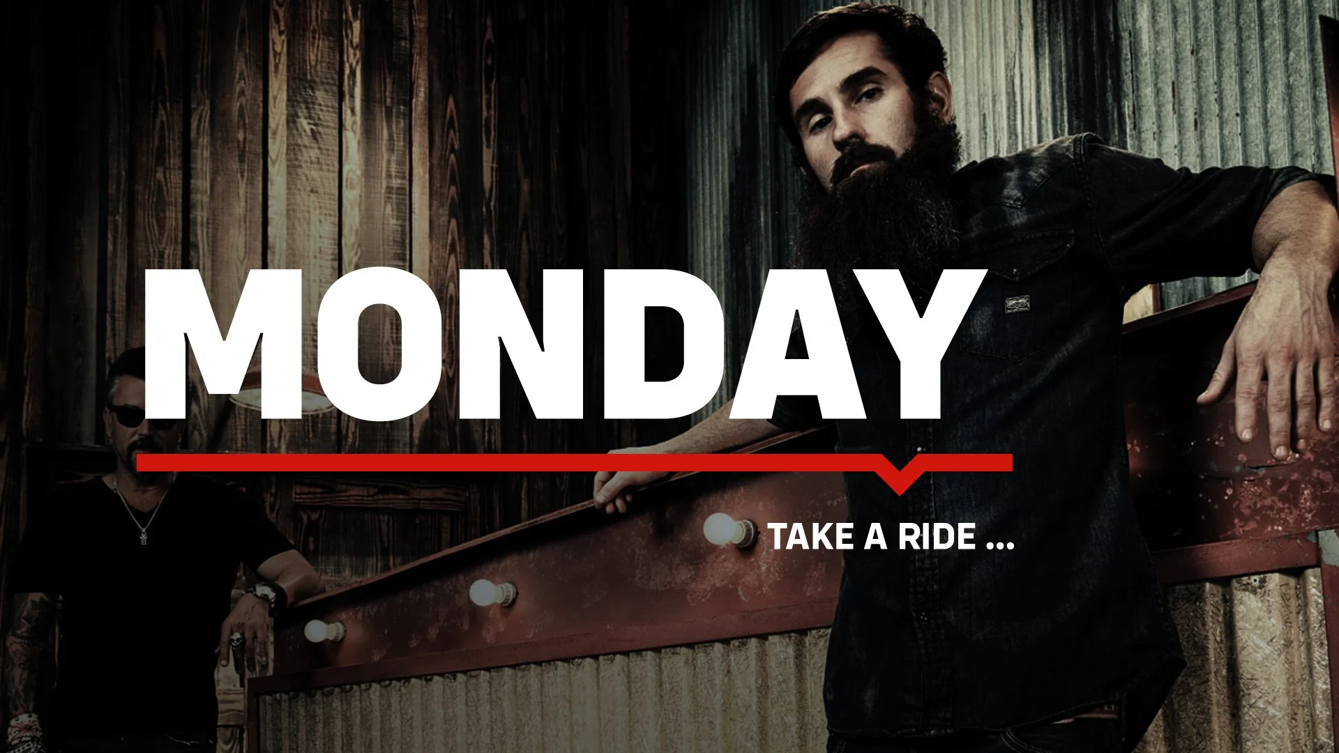
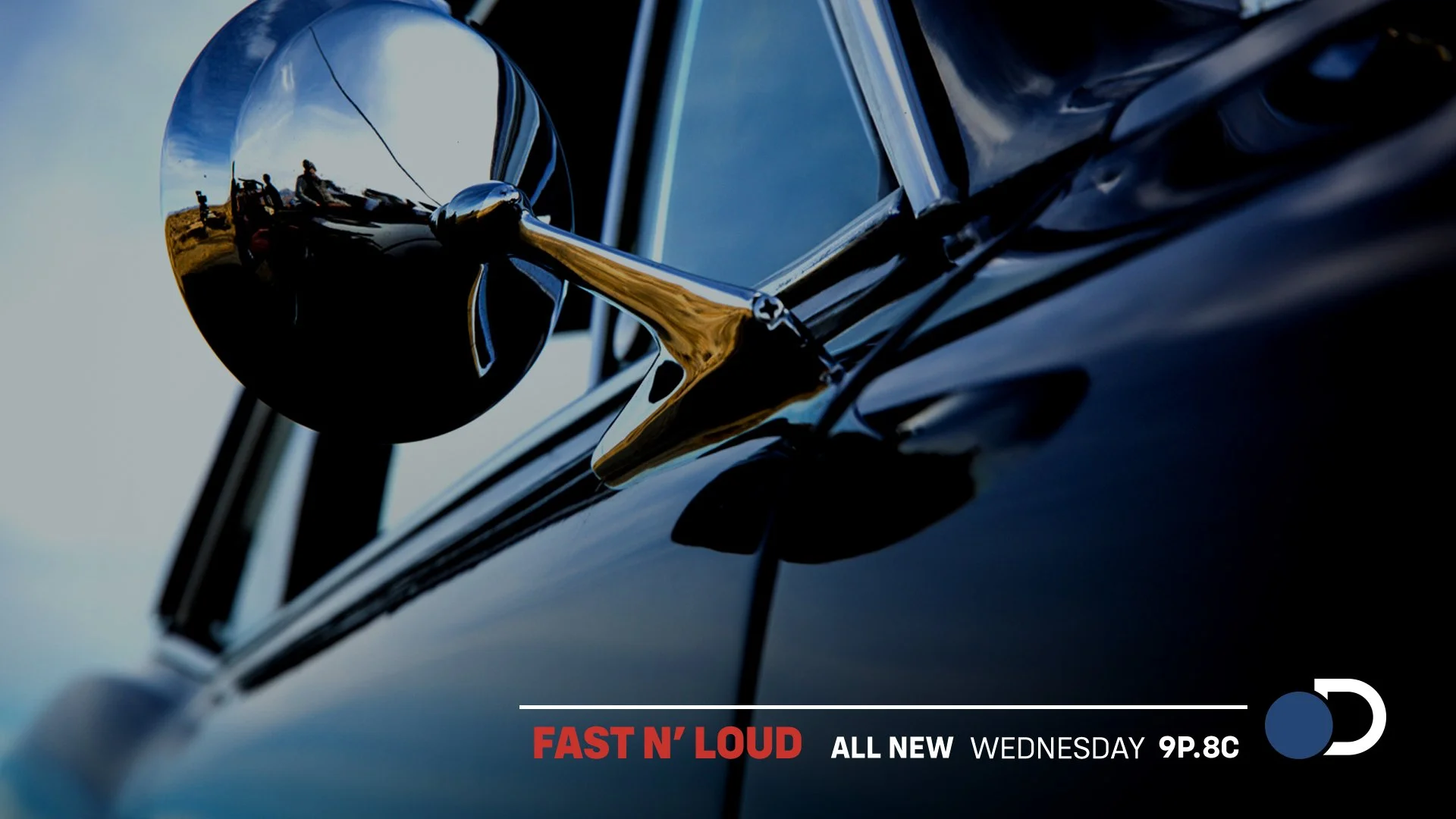
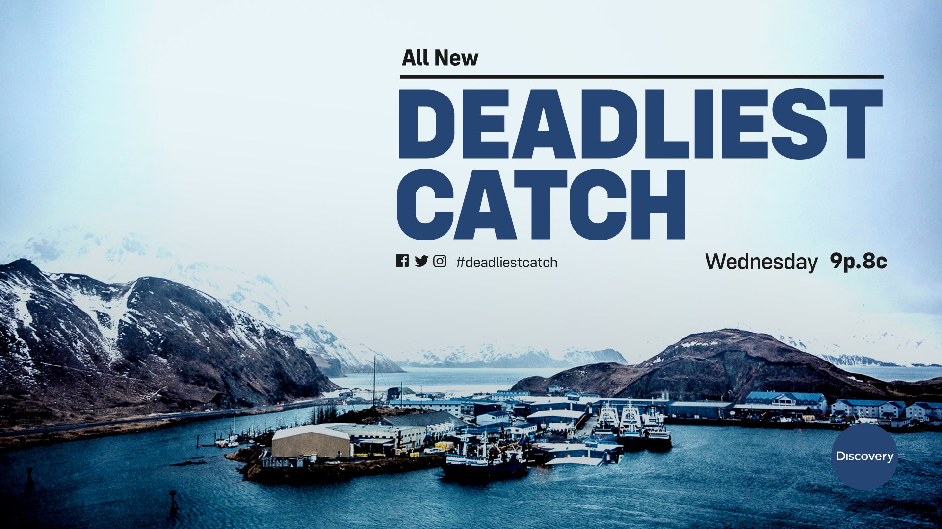
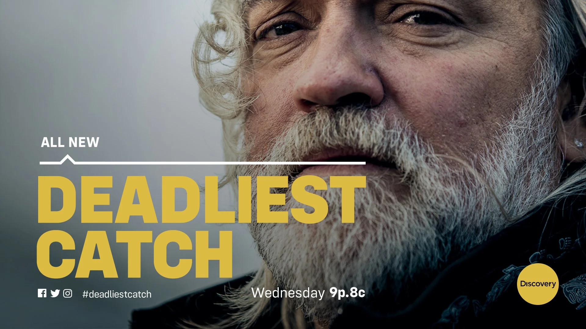
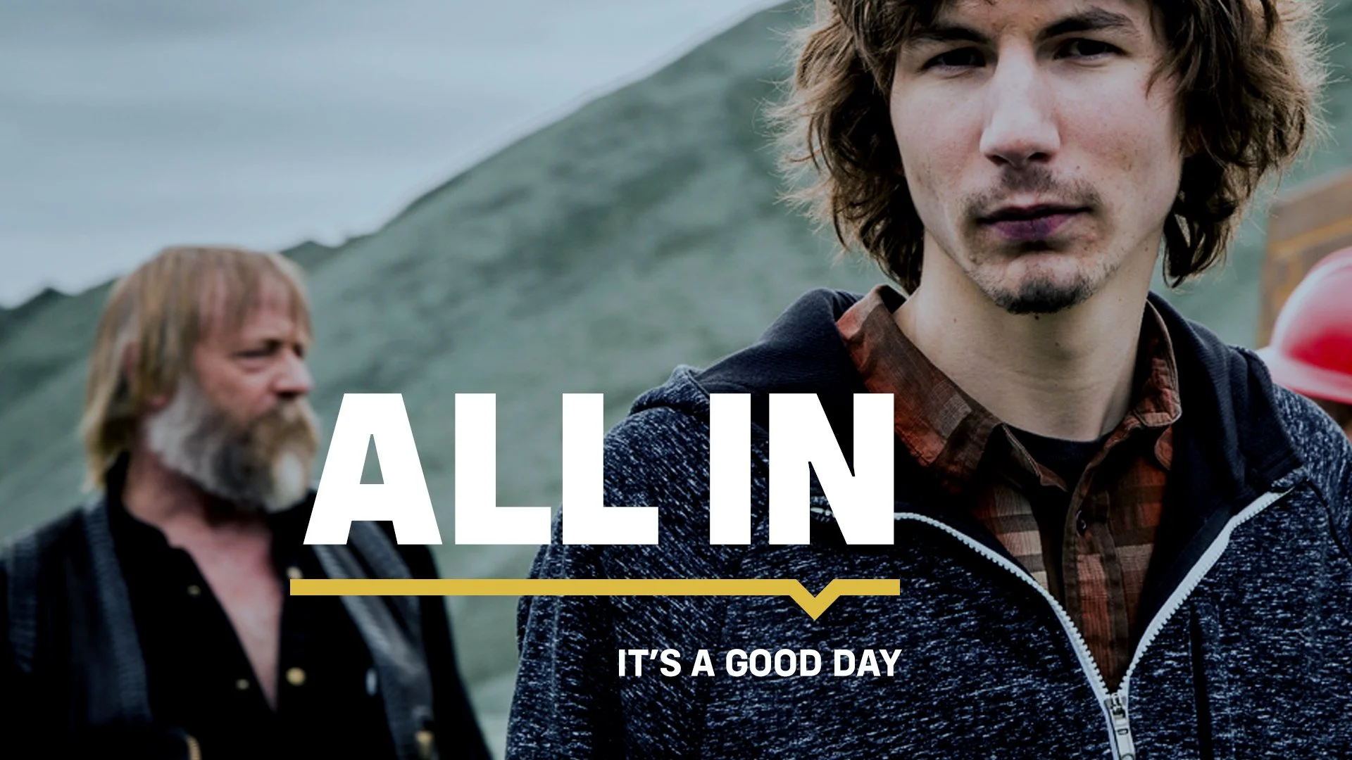
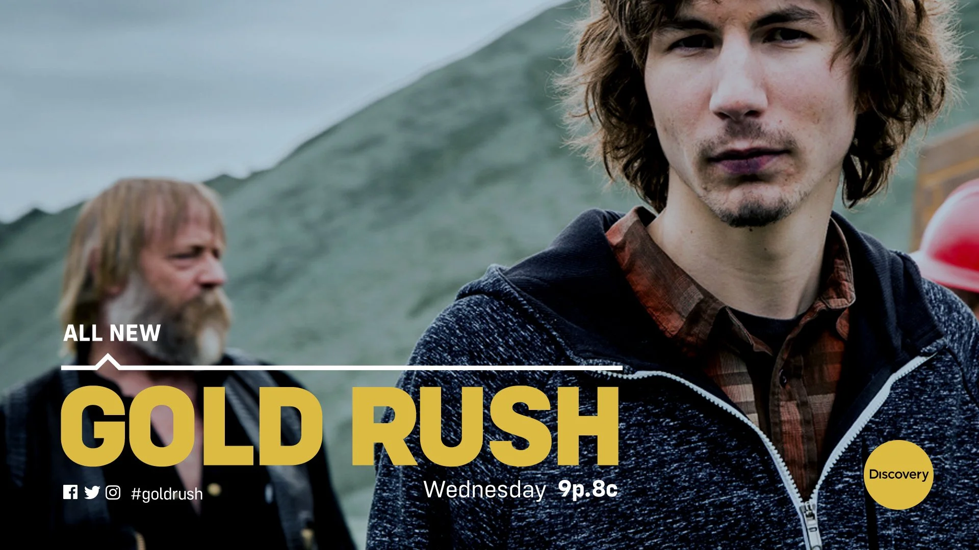
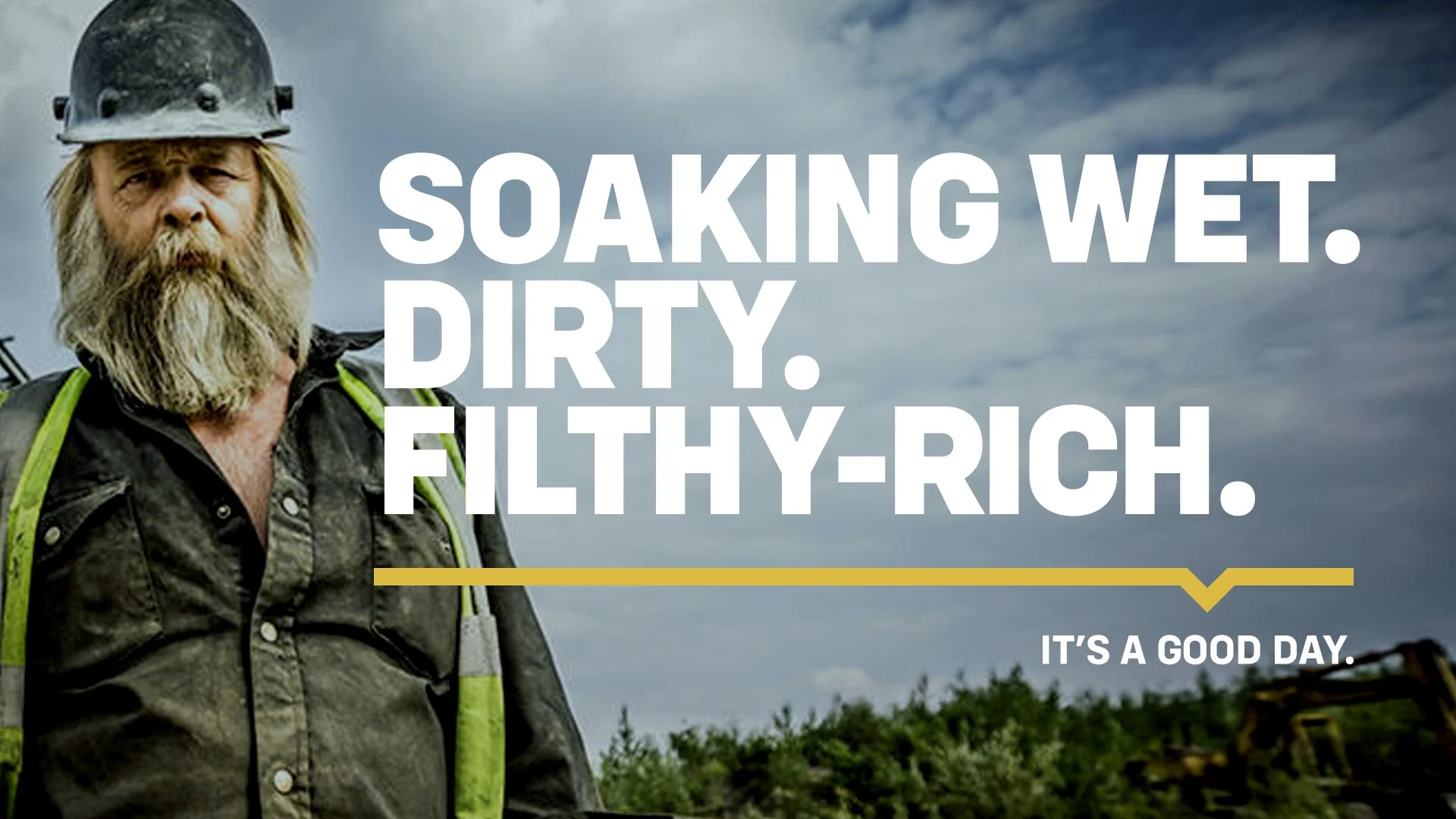
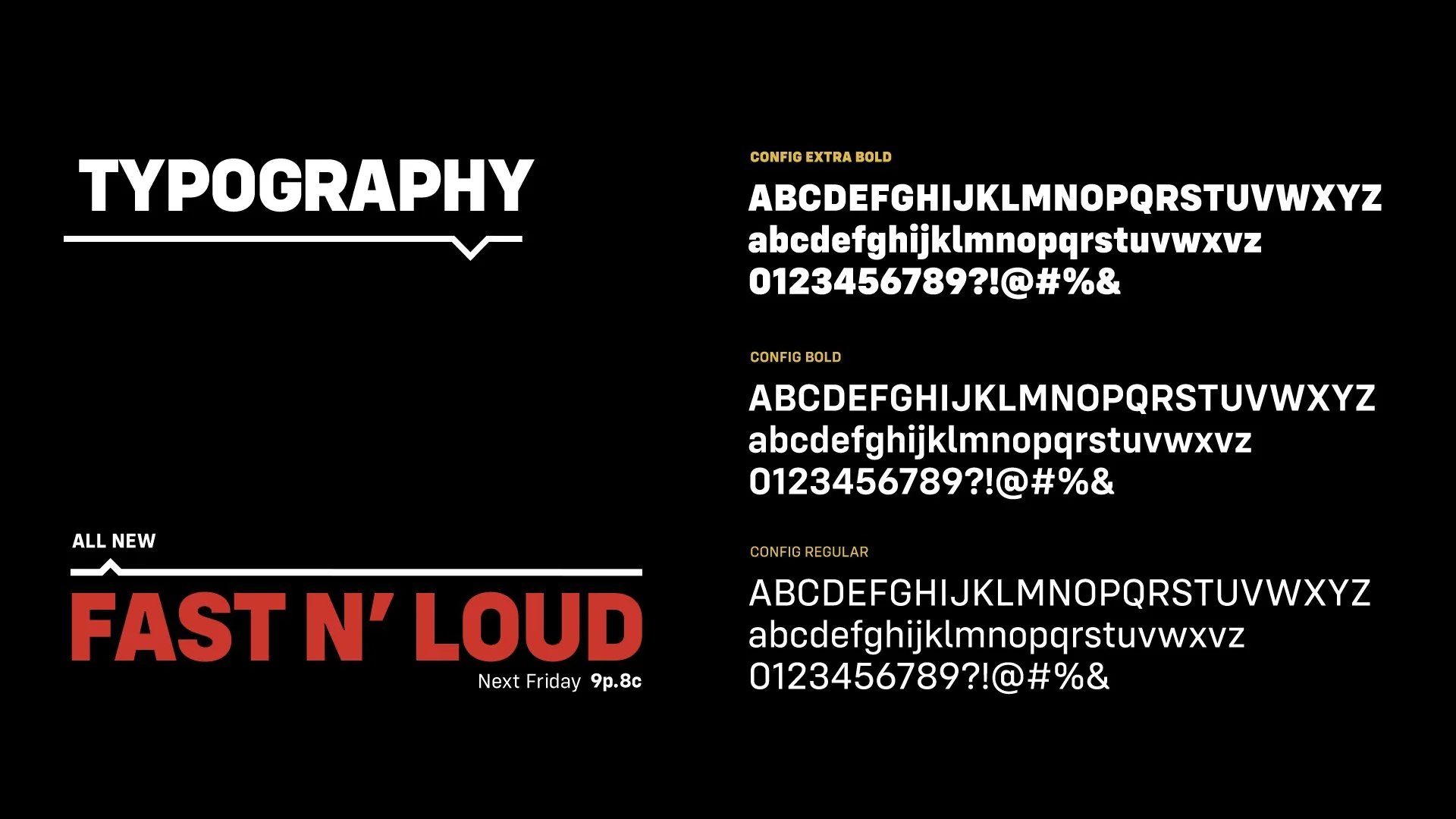
For the 2019 rebrand I was tasked with developing a fresh, updated look for the network while still including a nod or two to the brand development from 2016. I retained the bold typography and use of all caps but updated the look with a new font. I also repurposed the Discovery "locator" by breaking it out of the box container and including it in a graphic divider. The new device would serve to help organize information and point to tag lines and key messaging while allowing the footage and typography to breathe.
>

Discovery wanted to emphasize their seamless global reach across all platforms, and the current logo, which settles on the North and South American continents, no longer served that objective. The lockup of the Discovery globe and D-mark has become so identifiable that we decided to have the globe filled in with a solid color, rendering it geographically neutral and creating a bold, clean mark that would still be immediately recognizable.
>